Better data, more powerful AI and enhanced techniques are beginning to give scientists an edge in plotting Covid's evolution. JL
Emily Waltz reports in IEEE Spectrum:
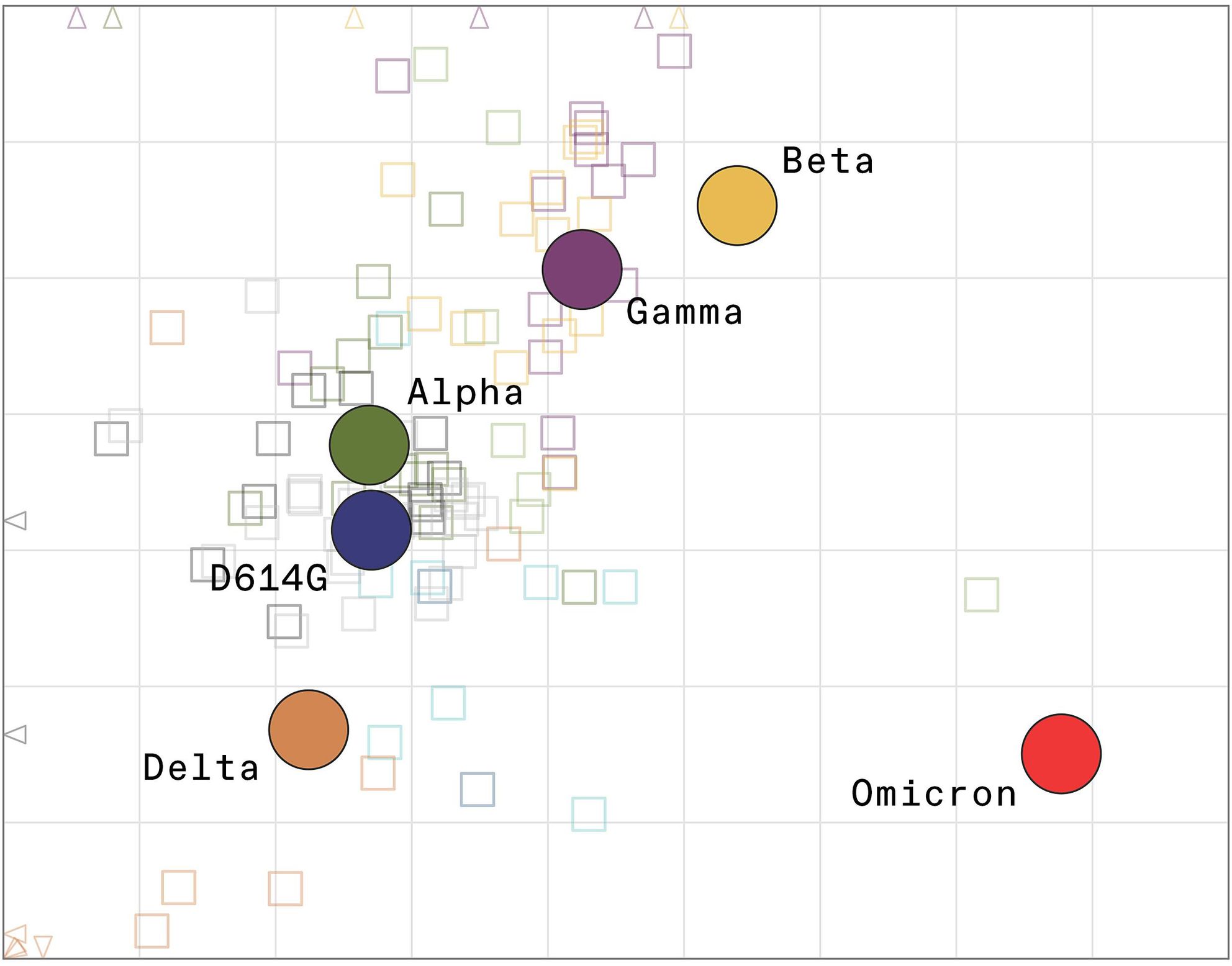
Antigenic cartography, uses esoteric math to interpret and visually represent lab data as a simple two-dimensional map. This mapping helps scientists stay on top of variants and has quietly become a workhorse in the fight against the pandemic. Omicron doesn’t plot anywhere near the original strain on which the world’s vaccines are based, nor does it plot near previous dominant variants such as Delta or Alpha. (Using these tools) scientists will get better at anticipating the virus’s next moves and crafting vaccines against it, just as they have for the flu.WHEN OMICRON, the now ubiquitous COVID-19 variant, first emerged in South Africa in November, scientists were immediately worried. Genetic sequencing showed that Omicron boasted dozens of mutations in key regions of its genetic code—about four times more than previous variants. Still, they did not know how much Omicron differed physically, not just genetically, from previous variants.
That’s crucial information in the fight against SARS-CoV-2, the virus that causes COVID-19. It’s the physical changes—alterations in how a virus looks and functions—that enable such a pathogen to cause infections by evading the immune systems of people vaccinated or infected with prior strains.
Derek Smith’s method of mapping viral antigens was first used to track how flu strains were changing. JAMES KING-HOLMES/SCIENCE SOURCE
Genetic sequencing gives researchers early clues about those changes, but only laboratory and clinical testing can indicate what they mean for the human immune system and current vaccines. To that end, scientists around the world have been frantically studying Omicron to determine how much the variant differs physically from the original coronavirus strain and whether new vaccines are needed—not just for Omicron, but for whatever comes next.
That work involves conducting old-fashioned blood tests that generate a complicated, multidimensional matrix of data that only a small number of experts in the world can interpret by eye. Fortunately, though, a clever computational method is making the data more accessible. The tool, called antigenic cartography, uses esoteric math to interpret and visually represent lab data as a simple two-dimensional map. This mapping helps scientists stay on top of variants and has quietly become a workhorse in the fight against the pandemic.
A few days ago, in a paper published on a preprint server, public health decision makers finally got a look at the data they’d been waiting for: an antigenic map plotting Omicron’s position relative to prior variants. The map told a visual story that no one wanted to see: Omicron doesn’t plot anywhere near the original strain on which the world’s vaccines are based, nor does it plot near previous dominant variants such as Delta or Alpha. On the maps, Omicron sits by itself, like a lone island in the middle of an ocean.
That finding explains the real-world evidence of the past few months, in which “breakthrough” infections among vaccinated people have become commonplace. And it supports Pfizer’s and Moderna’s decisions to develop vaccines specific to Omicron. However, those new vaccines won’t be ready for the public until at least March. In the meantime, people can get a booster shot of the original vaccine, which helps reduce the severity of the disease, public health experts say. But new vaccines and booster shots are temporary countermeasures; more variants will undoubtedly emerge, taunting scientists in a constant game of catch-up.
There is hope, however. Scientists will get better at anticipating the virus’s next moves and crafting vaccines against it, just as they have for the flu. And the computational power of antigenic mapping sits at the heart of that work.
The map told a visual story that no one wanted to see: Omicron doesn’t plot anywhere near the original strain of coronavirus.
Before COVID-19 was a word, antigenic cartography proved itself in another vaccine-crafting process: that of the annual flu vaccine. Twice a year, the World Health Organization (WHO) convenes experts and tasks them with determining which flu strains should go into the next season’s flu vaccine. For the past 17 years, their decision has largely been based on their reading of antigenic maps.
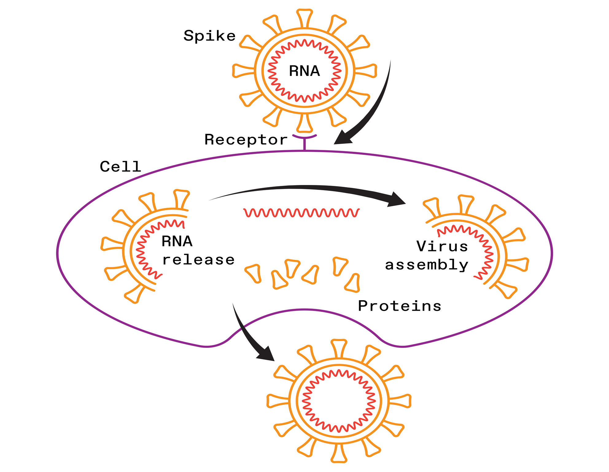
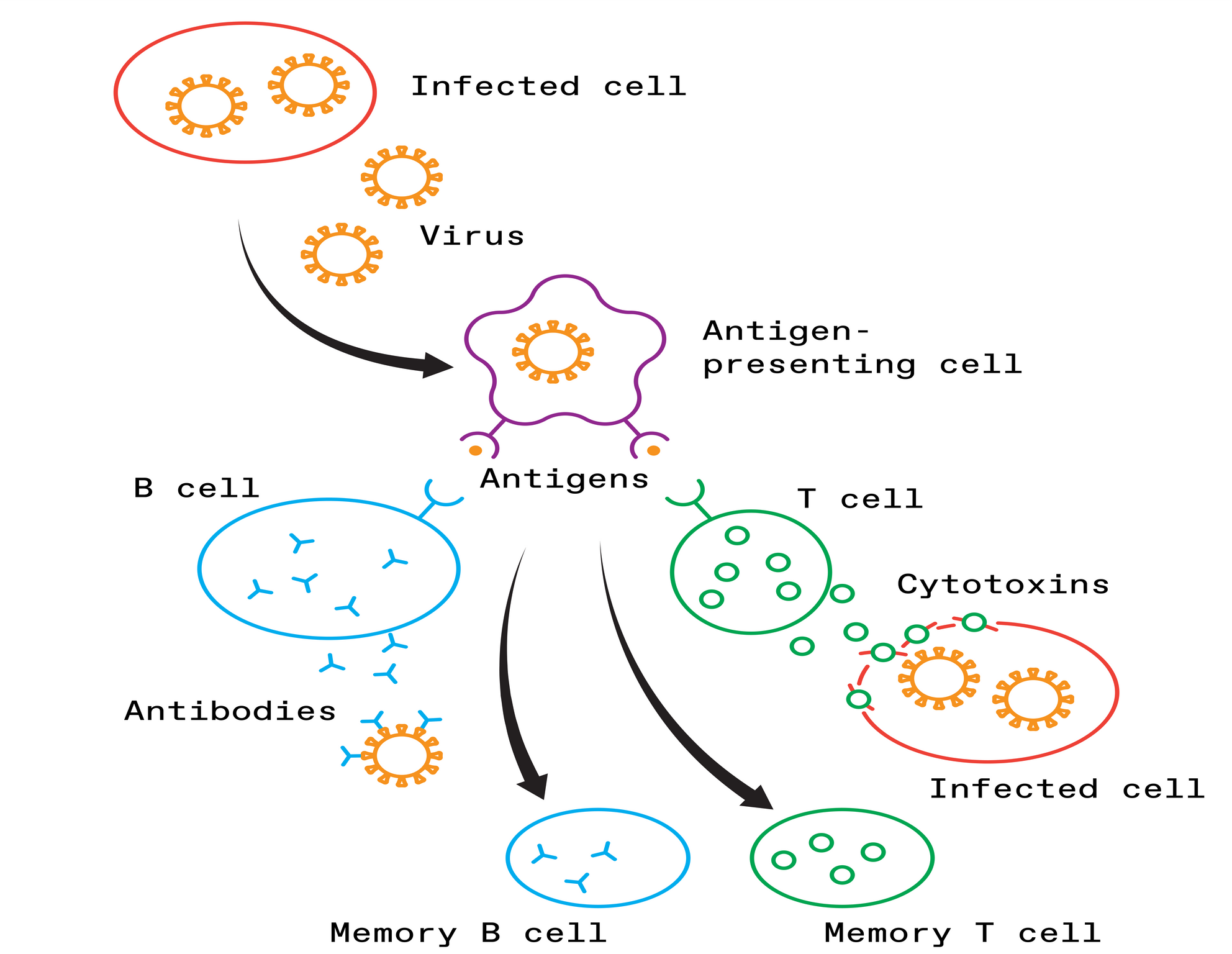
Antigenic cartography is based on an analysis of a virus’s antigens, which are the key structures that our immune systems can recognize. When a virus invades the human body, antibodies produced by the immune system will recognize the antigens, bind to them, and neutralize the virus.
But viruses are constantly evolving. An influenza virus’s genetic code can change every time it replicates. Most of these mutations are meaningless errors, but some cause physical changes to the virus, including to the antigens. With enough mutations, the antigens start to look different. Then the immune system’s antibodies, which were produced in response to previous infections or vaccines, may no longer recognize the antigens. That’s when people get sick and potentially transmit the new viral variant to others.
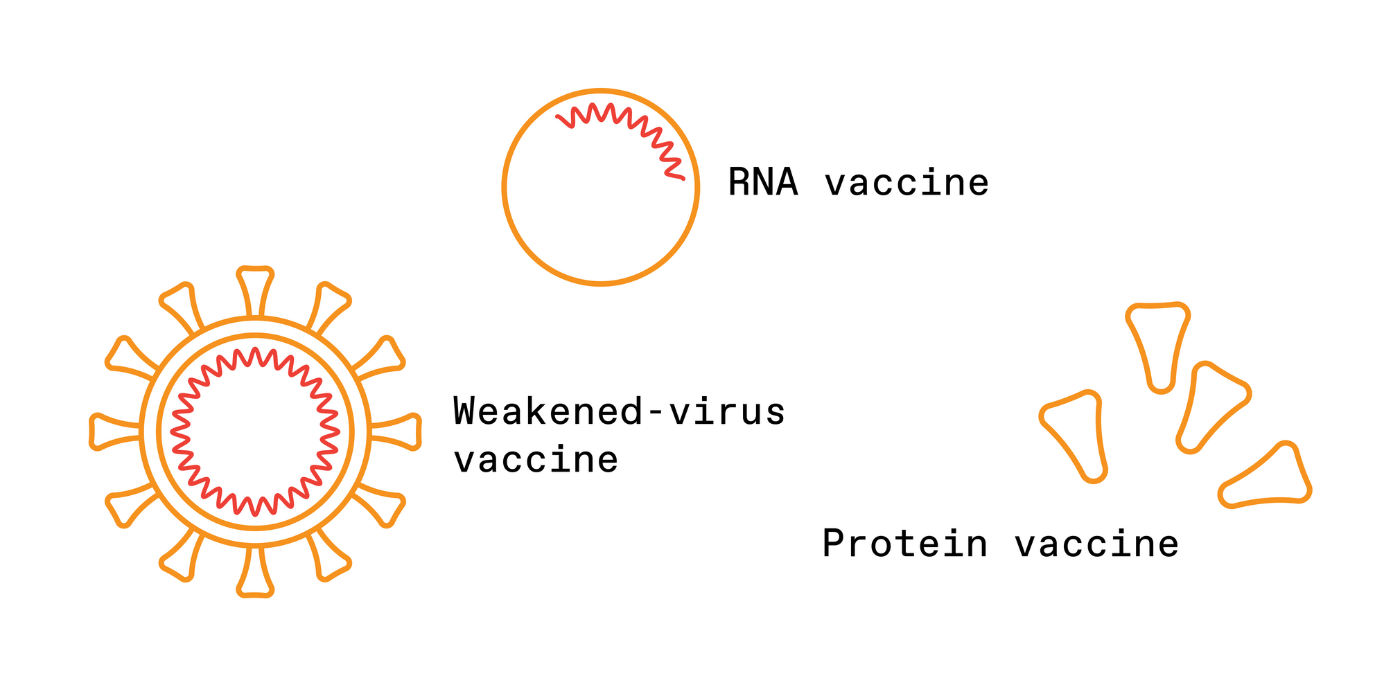
Scientists closely monitor these physical changes to the antigens, known as “antigenic drift.” This surveillance helps them design vaccines that more closely match the latest viral strains. The updated vaccines will contain components of the new antigens, giving the body a head start in preparing antibodies against the viral strains that are currently, or will soon be, making the rounds.
For flu, monitoring antigenic drift involves conducting a slew of blood serum tests in the lab and looking for patterns in the data. Researchers conduct thousands of tests to see how antibodies generated in response to previous vaccines and infections react to new flu strains. These tests place numerical values on the antibody responses, giving an indication of how much the virus’s antigens have changed. This daunting task is managed by centers in London, Tokyo, and Beijing; Atlanta and Memphis in the United States; Melbourne, Australia; and Koltsovo, Russia. These centers collaborate through the WHO and are assisted by national influenza centers in more than 100 countries. The group meets in February to choose a vaccine for the Northern Hemisphere’s flu season and in September for the Southern Hemisphere.
Most of this work is done in ferrets, whose antibodies respond to the flu virus much like those of humans. Researchers will infect each animal with a different strain of the flu, collect their blood, and then test it to see how the ferret’s antibodies hold up against new strains. Over the course of a year, a lab might infect up to 100 ferrets and test their blood, called antisera, against 1,000 different virus samples they’ve collected from flu-positive people.
This process generates tables of cross-reactivity data that “boggle the human mind,” says Philip Dormitzer, who spoke with Spectrum while head of viral vaccines at Pfizer, and now runs GSK’s vaccine R&D. Each row in a table represents a new virus sample from a flu-positive person, and each column represents antisera from infected ferrets. The numbers in the table show how well the antisera neutralize the viruses.
Scientists look for patterns in the data that suggest how close, antigenically speaking, the new strains are to old ones. Then they compare their patterns to those seen at other collaborating labs. Only a select few experts are capable of analyzing this esoteric data, and until 2004, they did it mostly in their heads.
Derek Smith is not one of those experts. Smith, a data scientist who specializes in infectious disease informatics at the University of Cambridge, set out in the early 2000s to understand the antigenic differences among strains of flu in a more precise way. But he couldn’t do it by eyeballing the tables—he needed a computational method.
Around the same time, in the Netherlands, molecular virologist Ron Fouchier, of Rotterdam’s Erasmus Medical Center, also wanted a computational method. “I was discouraged by my colleagues who had been reading these tables by eye for decades. They said [a computational method] was impossible and that many people had tried it,” says Fouchier. “I started initially to process the data myself—I figured that it wouldn't be too hard to interpret them. But I was wrong.”
Fouchier found Smith, and the pair devised a computational method to interpret and visually represent the data in one color-coded map, which resembles a map of an archipelago. Each virus strain is given a color. Viruses that are similar to one another, antigenically speaking, are plotted close together in clusters. These form islands, and the distance between each island represents the antigenic differences, or distance, between viral strains. Dubbing their method “antigenic cartography,” Smith, Fouchier, and their colleagues used the tool to plot 273 flu strains that had circulated since 1968. They published their results in a splashy paper in the journal Science in July 2004.
Two weeks later, WHO researchers invited Smith to join their next flu-vaccine meeting. They wanted to know if the mapping technique could be applied to current flu-strain data coming in from around the world, helping them to pick a vaccine. So Smith spent the next three months running that year’s flu data through his cartography process, and he presented the map at the WHO’s September flu meeting.
“You’re in a room with the world’s top experts on antigenic differences among strains of flu, and you're presenting a new way to look at these data—the precise data that they're focusing on that week for the vaccine strain-selection meeting,” recalls Smith. “It’s this fantastic peer-review moment.” The WHO collaborating centers have been using antigenic cartography in their flu-vaccine decision making ever since, and Smith has attended the meetings every year. “We didn't just write the method and then go away,” he says. “We also got involved in that WHO process.”
The maps made it easier for researchers to communicate about the way flu viruses were changing and gave them confidence that the patterns they saw in the data were real. “It’s fancy computation to reduce things to a very humanly understandable display,” says Dormitzer.
John McCauley, director of the World Influenza Centre at the Francis Crick Institute in London (one of the WHO’s flu collaborating centers), is one of the few people in the world who can interpret large tables of antigenic data by eye. He sees antigenic mapping as an assistive technology and argues that researchers should still analyze the data themselves, rather than hand the task entirely over to a computer. “I just hope that if anybody does embrace the cartography fully, that they look in detail” at the data, he says.
Antigenic cartography has its roots in a mathematical technique called “multidimensional scaling,” which has been around since the 1960s. The algorithm uses data about the distances between pairs of objects to reconstruct a map of the objects’ relative locations. For example, if you had a table that lists the distances between a bunch of U.S. cities—like you might find in a road atlas—you could use a multidimensional scaling algorithm to reconstruct a map of those cities based solely on the distances between them.
Seattle would land in one corner, New York in another corner, Dallas would fall in between those two and lower down, and so on. The algorithm can sort out their relative locations using only the mileage between each pair of cities. Something similar can be done for viruses. Researchers determine how effectively antibodies created from one viral strain neutralize a new strain, and that value becomes the “distance” between those two strains. The algorithm then plots their relative positions on a map.
"It's a devilishly clever way to analyze and communicate lots of data,” says David Wentworth, chief of the virology, surveillance, and diagnosis branch at the U.S. Centers for Disease Control and Prevention’s influenza division in Atlanta, one of the WHO collaborating centers. “It really helps communication with larger audiences that don't do this every day.”
Then Omicron hit. Since December, scientists have been rapidly conducting lab experiments to determine how people’s existing antibodies hold up against the new variant.
The technique also spurred new scientific insights, changing researchers’ understanding of how flu viruses evolve. Scientists for years had been observing the flu’s genetic mutations, but those don’t necessarily cause antigenic, or physical, changes in a virus. When Smith and Fouchier mapped the antigenic evolution of the flu over time and compared it with the genetic evolution, they discovered some interesting patterns. “We knew from the genetic data that the genetic evolution is very gradual,” says Fouchier. But flu’s physical evolution “is very punctuated and clustered, so not gradual at all,” he says. “This was really eye-opening to us.” Fouchier says the findings have led to new research on the molecular basis for those physical changes.
Over the past few years, Smith and his colleagues have built upon antigenic cartography by adding a third dimension to their maps. Dubbed “antibody landscapes,” the equations add a z-axis to the cartography, turning two-dimensional islands into three-dimensional mountains. The third dimension plots immune responses of antisera containing antibodies against multiple prior infections. This additional information illuminates which viruses may elude complex combinations of antibodies and helps scientists choose vaccines that fall a little ahead of the evolutionary curve.
Now Smith’s tools are at the center of data analysis for the pandemic. “There’s such a hunger for this information right now,” says Dormitzer. The U.S. National Institutes of Health has convened a consortium of more than a dozen laboratories to monitor the antigenic drift of the coronavirus that causes COVID-19. The consortium, called SAVE (SARS-CoV-2 Assessment of Viral Evolution), also funds Smith’s antigenic cartography work.
The labs are using antigenic cartography to study the relationships between current variants and “to be prepared to spot one that could be a big problem and know how to design a vaccine that will be effective against it,” says David Montefiori, who directs the Laboratory for AIDS Vaccine Research and Development at Duke University Medical Center and is involved with SAVE. He adds that if a variant “is pretty distant from all [the previous ones], then we know that could be a serious problem.”
Major variants prior to Omicron, including Delta, fell roughly into four separate clusters. On the antigenic map, the clusters plot relatively close to each other and to the original strain on which the current vaccines are based. That proximity meant that the vaccines worked reasonably well for all of them.
Then Omicron hit, replacing Delta as the dominant strain in many regions and causing huge spikes in cases globally. Since December, Montefiori and many other scientists have been rapidly conducting lab experiments to determine how people’s existing antibodies hold up against the new variant. To accomplish this task, they take blood from people who have been vaccinated or infected, expose it to the new variant, and measure how well the antibodies in the blood can attack and neutralize the virus. Then they run their data through Smith’s antigenic cartography software.
In analyzing the data, Smith and his team look at not only the distance between Omicron and the vaccine strain but also its distance from other variants such as Delta and Beta. Getting the necessary data from various labs around the world took some time. Initially, Smith says, they were in “the fog of war.” But they’ve made good progress: “We think we now have a good picture of what the situation is,” he says.
The map he and his colleagues published a few days ago on the preprint server BioRxiv shows that Omicron lands about twice as far away from the vaccine strain in comparison with all previous variants. This finding confirms what is now clear: that the current vaccines are less effective against it. Indeed, Montefiori’s laboratory data found that Omicron is up to 35 times less sensitive to neutralization by antibodies from individuals vaccinated with two doses. A third dose boosts antibodies considerably against Omicron, but their neutralization power wanes over time.
The incredible number of resources the world is throwing at the pandemic has enabled the research to move at an unprecedented rate. But there are limitations. One is that researchers studying COVID-19 must rely on people for blood samples, rather than the ferrets used for flu. Ferret antibodies don’t seem to react to SARS-CoV-2 variants the same way human antibodies do, and no other animal has emerged as an alternative.
This slows down the work because human samples are more laborious to obtain. They are also sometimes tainted by the person having had more than one infection. For example, in the early weeks of the Omicron wave, “it was not possible to find serum samples from people who recovered from an Omicron infection and were not previously immunized or infected with an earlier variant,” says Montefiori. “The cartography will still be informative but not as complete as I would like it to be.”
As more complete maps come into view, epidemiologists and vaccine developers can use them to make educated guesses about the coronavirus’s next moves. It’s possible that we’ll transition from the acute phase of the COVID-19 crisis to the lingering reality of an endemic disease, like the flu. The WHO has already convened a committee to determine when to update COVID-19 vaccines and with which strain of the virus. Maybe getting an annual COVID-19 shot will become as routine as getting an annual flu shot.
We may have to face the sobering fact that COVID-19 isn’t going away. But if we read the antigenic maps carefully, we can stay on top of the virus’s evolution—and our strategies for combatting it can evolve with it.

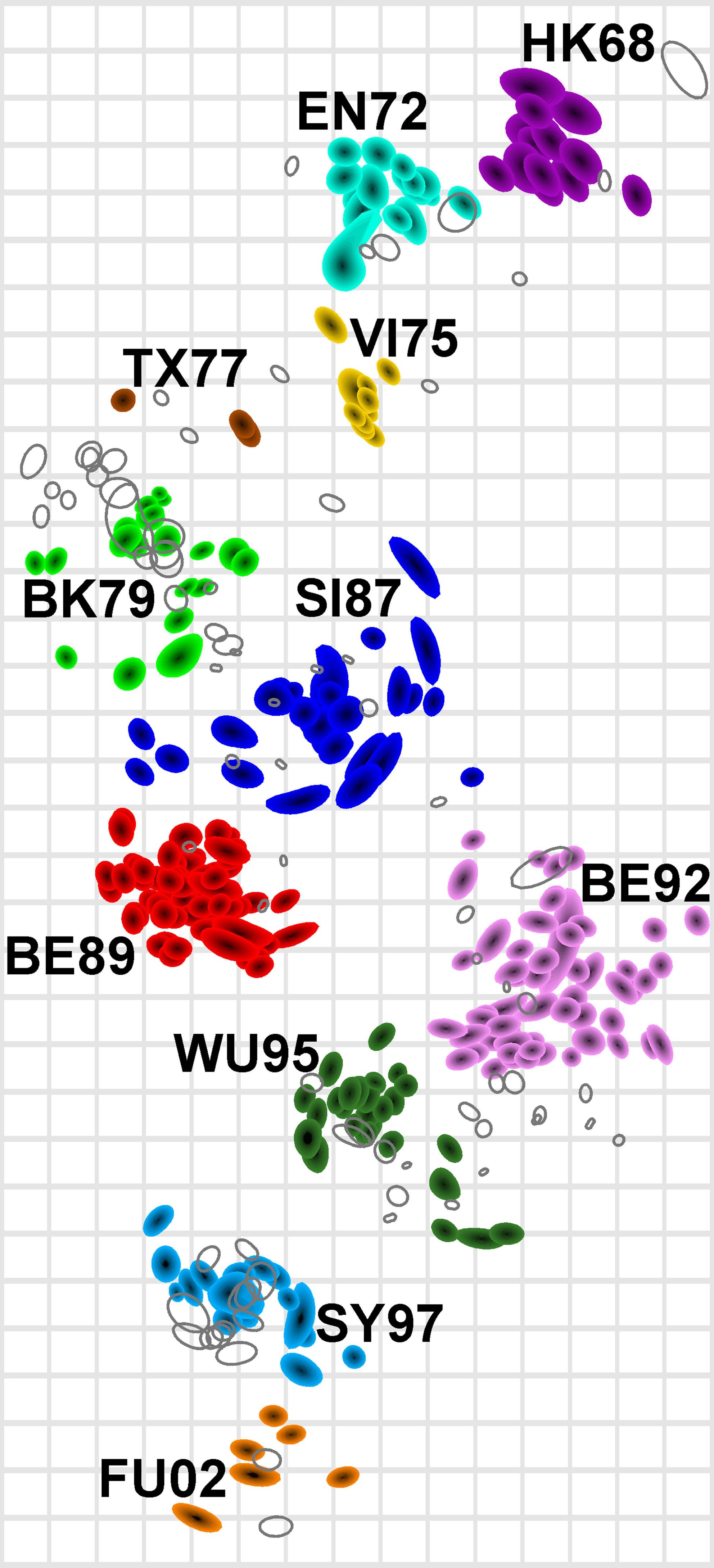 An antigenic map of the influenza virus shows how it has changed over the decades, from 1968 to the early 2000s. Each colored cluster represents variants that are similar to each other.


0 comments:
Post a Comment