The question is whether they still have the ability to overcome the forces opposed to their doing something about it. JL
Michael Batnick reports in The Irrelevent Investor:
It might be true that things have gotten better on an absolute basis, but we live in a relative world and on that basis, many have fallen behind. The rich today are richer than the rich used to be. Since 1972, the median worker kept pace with inflation. But real GDP has nearly quadrupled. Wealth inequality is expanding at an unsustainable pace. 22 million people just lost their job. They don’t have the luxury to argue about which price deflator is being used.
Yesterday I tweeted this image with the caption, “This is horrible. A lot of anger in this country can be traced back to this chart.”
- Is the average American better off today than they were four decades ago? Should they be?
- The median worker kept pace with inflation, what’s so bad about that?
- These numbers are very easy to manipulate depending on what story you want to tell
- Standards of living are much higher today than they were in 1972
- What about benefits that don’t show up in wages?
Is the average American better off today than they were four decades ago? Should they be?
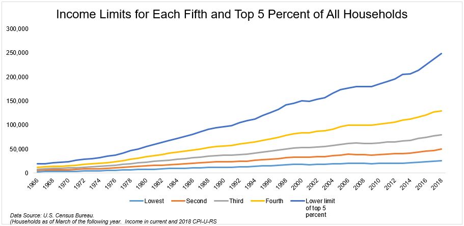
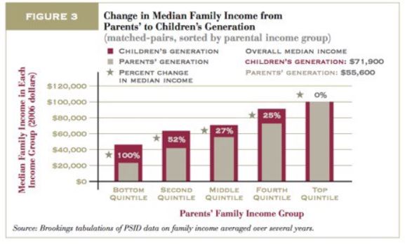
These are two separate but related questions. On the first one, things have unquestionably improved over time. For example, extreme poverty, infant mortality rate,murder rate, life expectancy, hunger, literacy, traffic deaths, war, and crime, are all heading in the right direction.When you point out that things are getting better, that doesn’t mean that things can’t also be bad. Bad and better are not mutually exclusive, as the late Hans Rosling points out:It seems that when we hear someone say things are getting better, we think they are also saying “don’t worry, relax” or even “look away.” But when I say things are getting better, I am not saying those things at all. I am certainly not advocating looking away from the terrible problems in the world. I am saying that things can be both bad and better.Things have unquestionably improved for the group, but that doesn’t necessarily mean that things have improved for the average person.It’s hard to compare across decades. On the one hand, you used to be able to raise a family on the median income. On the other hand, think about the improvements in technology and entertainment. I’m not saying one offsets the other, I only point this out to show that these are not apples-to-apples comparisons.As far as the question “should they be better off?” I think the answer is yes. Not because we deserve anything, but because the pie has grown, and a rising tide ought to lift all boats.But when you look at charts like the one below, this isn’t what you see. You see the gains disproportionately distributed to the upper class.There is a fairly large problem with the two charts I shared. As Russ Roberts points out, these are only a snapshot. Our economy is dynamic, and really should be viewed as a moving image. In an article Roberts wrote, Do the Rich Get All the Gains from Economic Growth?, he said:Adjusted for inflation, the US economy has more than doubled in real terms since 1975.How much of that growth has gone to the average person? According to many economists, the answer is none or close to none.…The biggest problem with the pessimistic studies is that they rarely follow the same people to see how they do over time. Instead, they rely on a snapshot at two points in time. So for example, researchers look at the median income of the middle quintile in 1975 and compare that to the median income of the median quintile in 2014, say. When they find little or no change, they conclude that the average American is making no progress.But if you follow people as they move up and down the ladder, you find that “The children from the poorest families ended up twice as well-off as their parents when they became adults.”The median worker kept pace with inflation, what’s so bad about that?
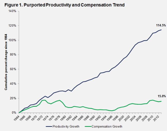
Since 1972, the median worker kept pace with inflation, which doesn’t sound so bad. But real GDP has nearly quadrupled, so where exactly are all the gains going? Wellllll……These numbers are very easy to manipulate depending on what story you want to tell
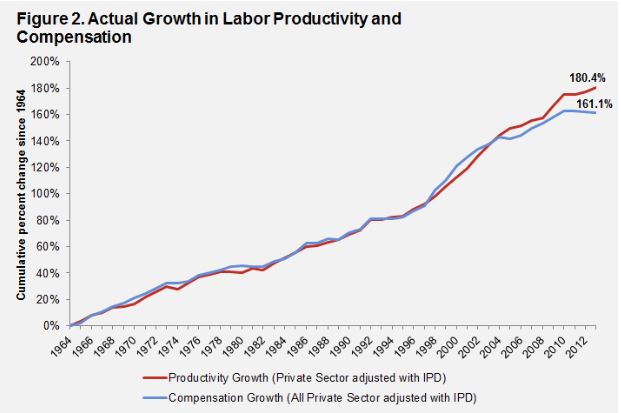
Cullen Roche linked to an article, Does Compensation Lag Behind Productivity?The gist of the article, which I recommend reading, is that:The assertion that regular workers do not benefit from economic growth is based on a faulty analysis that essentially underestimates the growth in real hourly compensation during the last half centuryAs I just mentioned, there is a giant chasm between how the economy has grown and how compensation has grown. The chart below is one version of what we frequently see.But it appears that we’re not looking at the right data. It turns out that compensation has actually kept pace with productivity growth when you compare apples with apples. Again, the article has all the details if you’re interested.It appears that perhaps the charts used to support the evidence that the average worker hasn’t received any real income appreciation might not be telling the full story. It’s important that we get this right, because as Rosling said, “Exaggeration undermines the credibility of well-founded data.”Standards of living are much higher today than they were in 1972
I wasn’t around in 1972, but I’m confident in saying that life is better today. From technology to the internet to entertainment and everything in between, I don’t think anybody would choose to go back.This entire post is a massively complicated subject, but this bullet point might be the toughest one of all.On the one hand we have an high powered encyclopedia in our pocket, and on the other we have the fact that the median income used to be enough to raise a family on. Again, I’m not saying one offsets the other, only that there are layers and layers to this debate.What about benefits that don’t show up in wages?
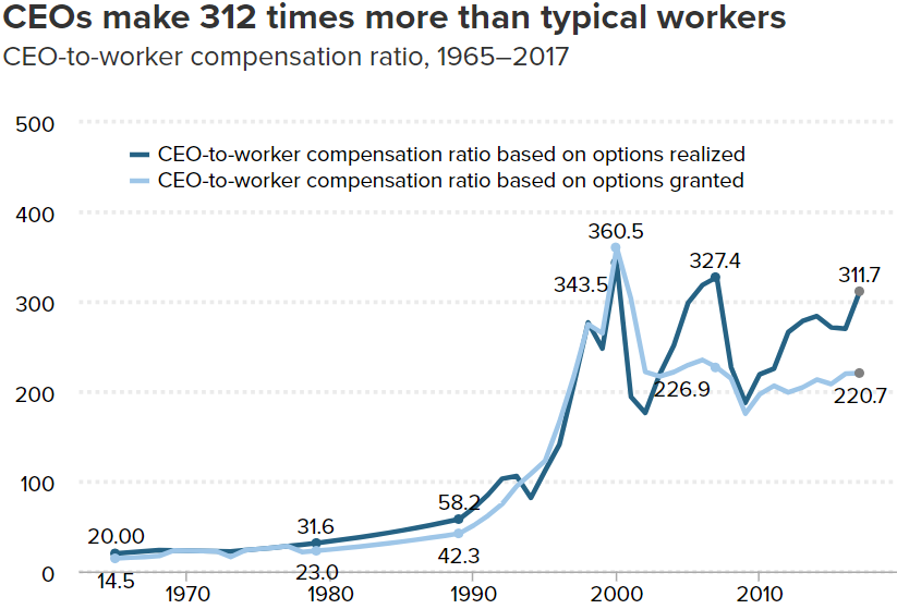
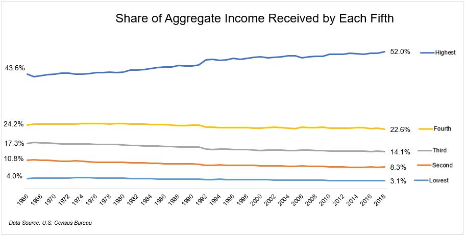
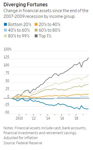
In an article “One Reason for Slow Wage Growth? More Benefits, Binyamin Applebaum writes:The average worker received 32 percent of total compensation in benefits including bonuses, paid leave and company contributions to insurance and retirement plans in the second quarter of 2018. That was up from 27 percent in 2000…Even including nonwage benefits, the growth of compensation is very slow by historical standards.I can’t imagine that benefits for the median worker are making up for stagnant wage growth, but this sub topic is its own rabbit hole and is beyond the scope of this post. Happy to read something if anybody has something worth reading.After reading through all of the responses to my tweet yesterday, I don’t think I chose the right image to attach to the comment. What I was going for was the unacceptable amount of wealth inequality we have in this country. The chart below is a better representation of the haves and the have-nots that’s driving a stake right through the heart of our society.It might be true that things have gotten better on an absolute basis, but we live in a relative world and on that basis, so many have fallen behind.The snapshots, like the one below, show that the rich today are richer than the rich used to be, and this is the issue. The American dream is alive and well, but that’s not what this is about. We’re tired of seeing the rich get richer, whether it’s the new rich or the old rich is irrelevant.According to Binyamin Applebaum in The Economists’ Hour, In 1971, the top 10 percent of households earned 31 percent of total income. By 2016, the top 10 percent took 48 percent. This is why people are angry.We can quibble about just how bad income inequality is, but what’s incontrovertible is that wealth inequality is expanding at an unsustainable pace. This morning the WSJ shared this image, which shows the change in financial assets since the end of the Great Financial Crisis.This is a massively complex question, and the data can be presented in a way to make any argument. But what’s not in question is that people are angry.They see this chart or charts like it and they think about the bailouts in 2008. They think about zero interest rates helping those who own assets and real estate. They think about executive compensation. And they think about the Fed.There can be a debate on how the data is measured, but there is no debate over how people feel. People in this country are angry, and Donald Trump and Bernie Sanders and Elizabeth Warren are all manifestations of this anger.17 million people just lost their job. They don’t have the luxury to argue about which price deflator is being used. They might not understand the intricacies of quantitative easing, or the nuances of buybacks, but they understand that they’re getting the short end of the stick.As I’ve said before, I believe in capitalism with every fiber of my being. But I also believe we need to do better. None of us should want to live an a country where so few have so much and so many have so little.




0 comments:
Post a Comment