A Blog by Jonathan Low


Jan 26, 2020

Google Backtracks On Ads Indistinguisable From Search Results After Criticism

What may be most interesting about this is not that Google was considering taking an action that would be financially and competitively advantageous to it versus to its customers, but that it would even consider, let alone retract, that decision due to criticism from outsiders. Which suggests how seriously it takes threats of regulation. JL


Jonathan Shieber reports in Yahoo :

Google announced that it would be redesigning the redesign of its search results as a response to withering criticism from politicians, consumers and the press over the way in which search results displays were made to look like ads. Google makes money when users of its search service click on ads. It doesn't make money when people click on an unpaid search result. Making ads look like search results makes Google more money.It's also a pretty unethical business decision. 
Google announced that it would be redesigning the redesign of its search results as a response to withering criticism from politicians, consumers and the press over the way in which search results displays were made to look like ads.
Google makes money when users of its search service click on ads. It doesn't make money when people click on an unpaid search result. Making ads look like search results makes Google more money.
It's also a pretty evil (or at least unethical) business decision by a company whose mantra was "Don't be evil"(although they gave that up in 2018).

Users began noticing the changes to search results last week, and at least one user flagged the changes earlier this week.
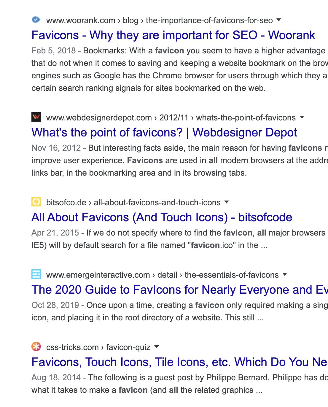
There's something strange about the recent design change to google search results, favicons and extra header text: they all look like ads, which is perhaps the point?
View image on Twitter
752 people are talking about this

Google responded with a bit of doublespeak from its corporate account about how the redesign was intended to achieve the opposite effect of what it was actually doing.
"Last year, our search results on mobile gained a new look. That’s now rolling out to desktop results this week, presenting site domain names and brand icons prominently, along with a bolded 'Ad' label for ads," the company wrote.
Senator Mark Warner (D-VA) took a break from impeachment hearings to talk to The Washington Post about just how bad the new search redesign was.
"We’ve seen multiple instances over the last few years where Google has made paid advertisements ever more indistinguishable from organic search results," Warner told the Post. "This is yet another example of a platform exploiting its bottleneck power for commercial gain, to the detriment of both consumers and also small businesses."
Google's changes to its search results happened despite the fact that the company is already being investigated by every state in the country for antitrust violations.

For Google, the rationale is simple. The company's advertising revenues aren't growing the way they used to, and the company is looking at a slowdown in its core business. To try and juice the numbers, dark patterns present an attractive way forward.
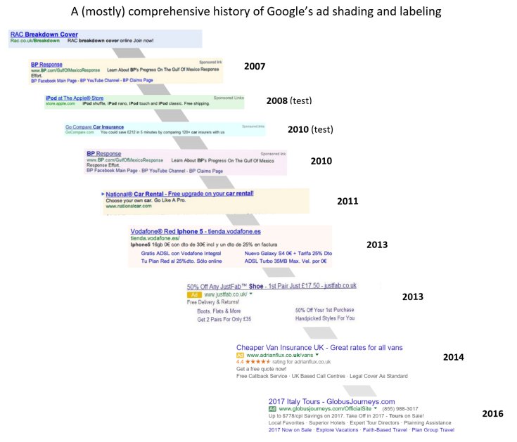
Indeed, Google's using the same tricks that it once battled to become the premier search service in the U.S. When the company first launched its search service, ads were clearly demarcated and separated from actual search results returned by Google's algorithm. Over time, the separation between what was an ad and what wasn't became increasingly blurred.

“Search results were near-instant and they were just a page of links and summaries – perfection with nothing to add or take away," user experience expert Harry Brignull (and founder of the watchdog website darkpatterns.org) said of the original Google search results in an interview with TechCrunch.
"The back-propagation algorithm they introduced had never been used to index the web before, and it instantly left the competition in the dust. It was proof that engineers could disrupt the rules of the web without needing any suit-wearing executives. Strip out all the crap. Do one thing and do it well.”
“As Google’s ambitions changed, the tinted box started to fade. It’s completely gone now,” Brignull added.
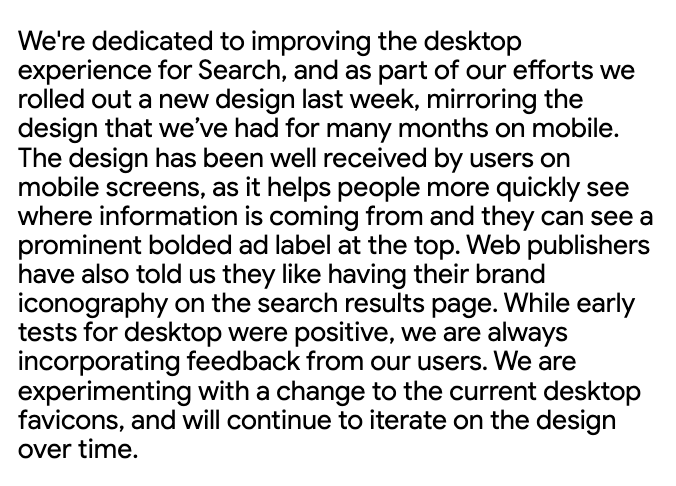
The company acknowledged that its latest experiment might have gone too far in its latest statement and noted that it will "experiment further" on how it displays results.
Our experimenting will begin today. Over the coming weeks, while we test, some might not see favicons while some might see them in different placements as we look to bring a modern look to desktop….
Here’s our full statement on why we’re going to experiment further. Our early tests of the design for desktop were positive. But we appreciate the feedback, the trust people place in Google, and we’re dedicating to improving the experience.
View image on Twitter
81 people are talking about this

0 comments:

Post a Comment