We don't know for sure where this is going, but even though the past doesnt necessarily predict the future, convenience and price will almost certainly have something to do with it. JL
Amy Hoy reports in Stacking the Bricks:
When something is easy, people will do more of it. And who, once offered a path of least resistance, has the energy to fight it all the way? The format won. The old web, the cool web, the weird web, the hand-organized web… died. And the reverse chronology bias — once called into creation, it hungers eternally — sought its next victim. Myspace. Facebook. Twitter. Instagram. Pinterest, of all things. Today social publishing tools are beginning to reverse chronological sort; algorithm sort surfaces content not by time posted but by popularity, or expected interactions, based on individual and group history.
I first got online in 1993, back when the Web had a capital letter — three, in fact — and long before irony stretched its legs and unbuttoned its flannel shirt. Back when you could really say you were surfing the net.
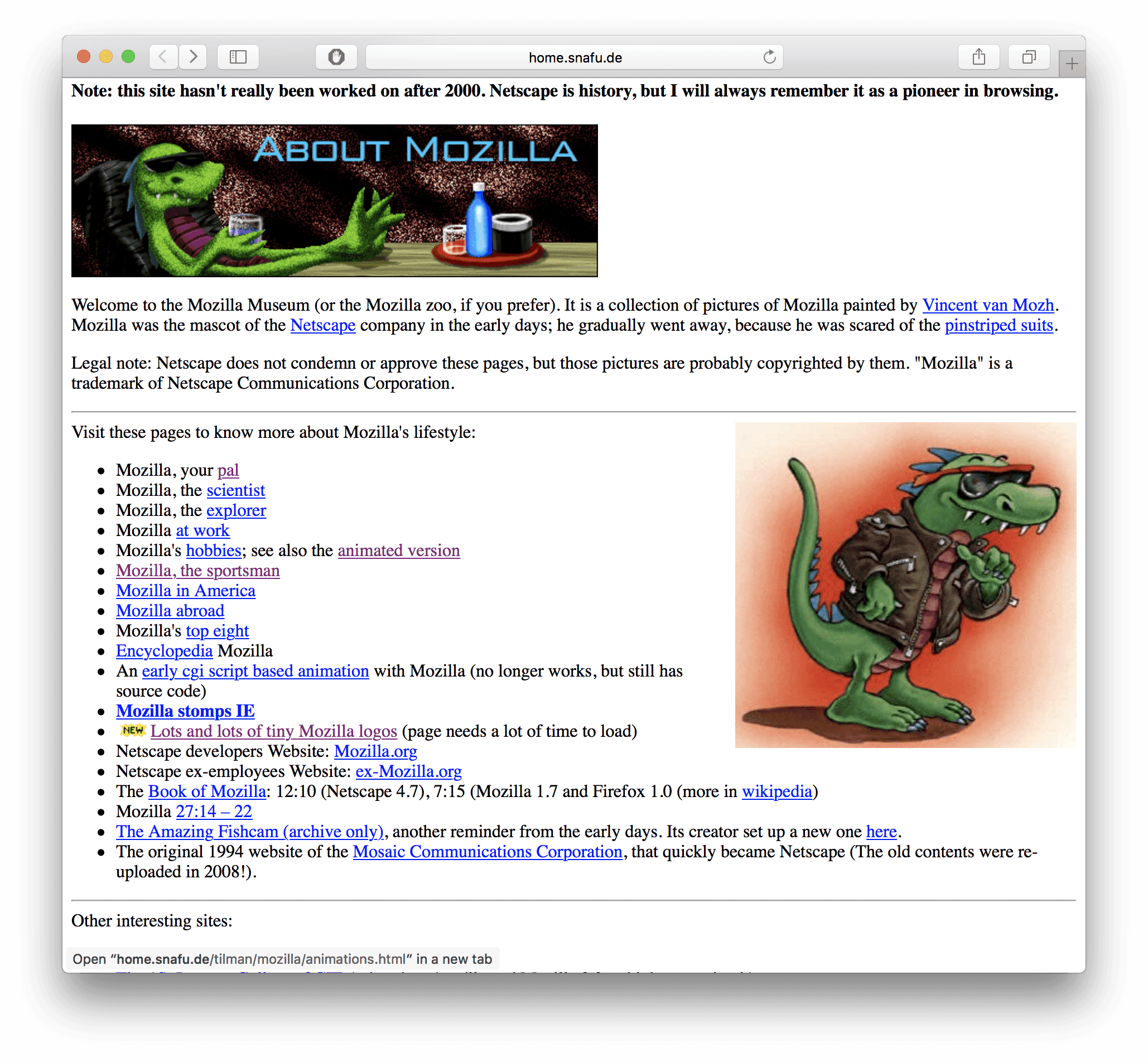
And the first thing I did when I logged on line, every single time, for years was to load up Netscape’s What’s Cool.
What’s Cool billed itself as the best way to learn what cool new web pages had appeared… across the WHOLE (Earth) Internet. And for a time, it truly was.
The Web was so small, then. So small that it was conceivable that one could maintain a list of every site.
And it really was both new and cool to use a 1-frame-a-minute webcam to spy on a coffee machine on another continent or click a Big Red Button That Does Nothing.
Back then, we didn’t have platforms or feeds or social networks or… blogs.
We had homepages.
The backgrounds were grey. The font, Times New Roman. Links could be any color as long as it was medium blue. The cool kids didn’t have parallax scrolling… but they did have horizontal rule GIFs.
Assuming you knew a handful of tags, it took about a minute to create a new web page.
There were no databases to configure. No scripts to install. No plugins, no security patches. There were no cookies. No iframes, no web-first scripting languages, no web apps.
We built every new page by hand. When we had more than one web page, we built the navigation by hand. We managed our Table of Contents by hand. We broke out our calculators to code boundaries for our image maps. We talked unironically about “hyperlinks.”
When we updated a page, we slapped a little “NEW!” graphic on it.
And not-new links? Well, you clicked them, then they turned purple.


No two homepages were alike. There was certainly no such thing as a Content Management System. But it didn’t mean that the homepage content wasn’t managed.
A well-organized homepage was a sign of personal and professional pride — even if it was nothing but a collection of fun gifs, or instructions on how to make the best potato guns, or homebrew research on gerbil genetics.
Dates didn’t matter all that much. Content lasted longer; there was less of it. Older content remained in view, too, because the dominant metaphor was table of contents rather than diary entry.
Everyone with a homepage became a de facto amateur reference librarian.
Obviously, it didn’t last.
⌘
In ‘94, a college student named Justin Hall broke free from the table of contents format. He added to the top of his homepage daily, and he headlined each section with the date. He shared everything: from interesting links he found to his experiments with sex and drugs.
Justin’s Links became the first daily web diary.
That’s what they were called then… web diaries. (The name weblog came a few years later, as some of their writers moved away from extremely personal topics.)
Most diaries existed as a separate section linked from the regular personal homepage of the diarist in question. The diary entries were either all inline content, like Justin’s, or individually linked from an index page.
But here was the big departure: the entries, either inline or linked, weren’t organized by content or primacy or importance or category.
They were always in reverse chronological order.
The diaries themselves looked like this:
They were, like the web itself, quirky and highly personal, often confessional in style. It was all so very Microserfs.
But it wasn’t very popular.
⌘
When jjg compiled his list of “web logs” in early 1999, there were only 23. That’s not a typo: Twenty-three, twenty-three web logs on the internet, ah ah ah. No doubt he missed many — and a bunch had lived and died by then, including mine — but by what kind of multiplier? Five? Ten times? So there were what, maybe 230 web logs?
By late 2000, there were still only 1,285 according to Eatonweb. Same disclosures apply on those numbers, of course, but seriously…
The “weblog” world was small.
The early web itself, of course, was pretty exclusive: first, you had to be online, then you had to know HTML, and that wasn’t enough, you also had to have a hosting account, and know how to use it. There was no royal road. Each would-be Netizen had to bushwhack their own path.
But there were thousands and thousands more personal homepages than weblogs.
Homepages had a timeless quality, an index of interesting or useful or relevant things about a topic or about a person. You didn’t reload a homepage every day in pursuit of novelty. (That’s what Netscape’s What’s Cool was for!)
Chronological content was in the minority.
The Internet at the time was largely populated by academics, professionals, and college students. Not everyone had the desire to publish their angsty poetry, sexcapades, or surfing habits on a daily basis; the other limiter on chrono-content was the sheer time and energy it required. Diarying was a helluva lot of work. First you had to have something to say, then write, edit it, format it, add clip art, edit your index.html, edit any prev/next links, check those links, and lastly, upload the files.
It was boring, tedious, and involved.
And that didn’t change when Blogger and Livejournal appeared on the scene in 1999 — the same year as jjg’s list of 23. Neither was an immediate success. For pioneers accustomed to the power of free-form HTML, their limited features and lack of control chafed.
⌘
The first real movement came in 2001. That’s when there debuted an invention that would revolutionize the way people across the globe distributed their written content:
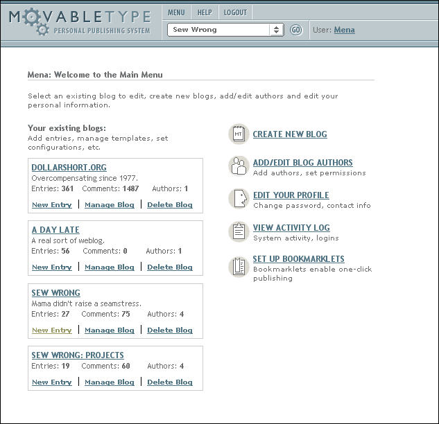
Movable Type.
No, not that one. This one:
MT wasn’t the first tool to facilitate rapid web publishing, but it was the first powerful one that appealed to the tweakers, the do-it-yourselfers, the webmonkeys.
It was also the first web-based CMS that you could download for free, install, and run on your own web host.
It was the first viable alternative to all that manual work. It made updating a weblog easy. Without giving up total control.
It was the first CMS many web folks ever touched, myself included.
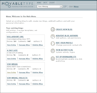
Like so many early web diary fans, I followed the adventures and musings of one Mena Trott. Her Dollar Short had started off looking like your basic weblog: functional, serviceable, no frills, lots of posts on one page because screw making all those different files by hand. Basically, it was ugly.
It was just too much to do all that hard work and make it shine.
But one day it got pretty.
And streamlined.
So minimalist!
It was astounding. Like living your whole life in a normal cluttered house in the normal boring suburbs surrounded by normal people with their own normal cluttered houses and then one day, waking up to find yourself in an issue of Architectural Digest.
People can live like this?
Could I live like this?
And there, the answer, at the bottom of the refreshing and streamlined page, there was a tiny little badge — remember badges? — whispering:
Powered by Movable TypeThe implication was clear: This care-free prettiness can be yours.
Who could resist?
⌘
Movable Type wasn’t a revolution, technically speaking. It wasn’t a live web app like the CMSes of today; it didn’t serve up dynamic content. It wasn’t fancy.
All it did was exploit the power of Perl scripts to do the same exact work we all used to do by hand: spit out static HTML files.
Culturally, though, it was devastating.
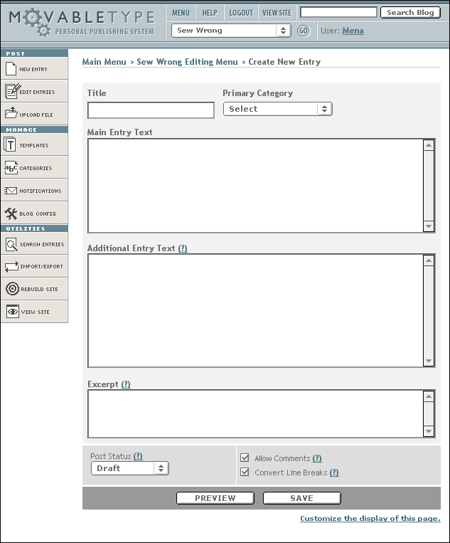
Suddenly people weren’t creating homepages or even web pages, but they were writing web content in form fields and text areas inside a web page.
Suddenly, instead of building their own system, they were working inside one.
A system someone else built.
Oh, sure, you could customize your Movable Type site. All you had to do was program the templates. It was more difficult than HTML, but not hugely so for someone who already maintained their own site. And if you couldn’t program yourself, well, you could copy and paste snippets. It seemed like the whole (tiny) blogosphere was sharing their favorites. Calendar sidebars for everyone!
There was just one problem…
It was a trap.
Those little sidebar calendars were bait.
⌘
Here’s the crux of the problem: When something is easy, people will do more of it.
When you produce your whole site by hand, from HEAD to /BODY, you begin in a world of infinite possibility. You can tailor your content exactly how you like it, and organize it in any way you please. Every design decision you make represents roughly equal work because, heck, you’ve gotta do it by hand either way. Whether it’s reverse chronological entries or a tidy table of contents. You might as well do what you want.
But once you are given a tool that operates effortlessly — but only in a certain way — every choice that deviates from the standard represents a major cost.
That’s what happened as Movable Type ate the blogosphere.
Homepage production became suddenly a question of economics:
And who, once offered a path of least resistance, has the energy to fight it all the way?
- Go with the system’s default format: zero work.
- Customizing the system to your format: way more work than pure HTML ever was
The format won.
It was easier — faster! — to literally go with the flow… of time.
⌘
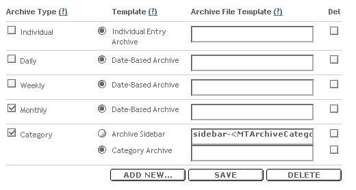
Movable Type was designed by bloggers who wrote new diary entries every single day. The form followed that function slavishly. Far from helping to organize or manage free-form content, the format was rigid: title, category, entry. And aside from the single entry itself, you had just four choices for page type: daily (chrono), weekly (chrono), monthly (chrono), and the surprise wildcard, category.
But inside that category archive, the posts were arranged by date. Automatically. No human input required… or allowed.
Thus began the Chronological Sort Era.
Or, as I like to call it:
CHRONOS RULES EVERYTHING AROUND ME.
⌘
Movable Type didn’t just kill off blog customization.
It (and its competitors) actively killed other forms of web production.
Non-diarists — those folks with the old school librarian-style homepages — wanted those super-cool sidebar calendars just like the bloggers did. They were lured by the siren of easy use. So despite the fact that they weren’t writing daily diaries, they invested time and effort into migrating to this new platform.
They soon learned the chronostream was a decent servant, but a terrible master.
The potato gun girl and gerbil genetics guy found they didn’t want to write updates. It didn’t make sense. Their sites should have remained a table of contents, a reference tool, an odd and slightly musty personal library… the new “posts” format simply didn’t work for what they wanted to do. It felt demanding, and oppressive.
But they’d already switched. They’d already spent all that time and energy and optimism. To switch back, they’d have to go through that process all over again. Only worse, of course, because they’d have to build the new (old) site completely from scratch. They had no tool to give it shape.
And once you’ve had a taste of effortless updates, it’s awfully hard to back to manual everything.
So they didn’t.
And neither did thousands of their peers. It just simply wasn’t worth it. The inertia was too strong.
The old web, the cool web, the weird web, the hand-organized web… died.
And the damn reverse chronology bias — once called into creation, it hungers eternally — sought its next victim. Myspace. Facebook. Twitter. Instagram. Pinterest, of all things. Today these social publishing tools are beginning to buck reverse chronological sort; they’re introducing algorithm sort, to surface content not by time posted but by popularity, or expected interactions, based on individual and group history. There is even less control than ever before.
There are no more quirky homepages.
There are no more amateur research librarians.
All thanks to a quirky bit of software produced to alleviate the pain of a tiny subset of a very small audience.
That’s not cool at all.






0 comments:
Post a Comment