All of this is good. We are learning and applying in real time, as well as learning to apply effectively as such.
The challenge, to both providers and users, is going to be first, the degree to which this capacity can be usefully designed to fit on the ever-decreasing screens through which we view it.
The second, and possibly more difficult hurdle, is assuring that we are able to absorb, by which we mean, make sense of, the knowledge with which we are being provided. Having willingly discarded the buffer that time, distance and the ability to reflect provide, we must now somehow present the data in ways that make it comprehensible as quickly as it is available.
It is not clear that we have achieved this - or are close to doing so. The history of adaptation suggests that we will learn, eventually. But to optimize the impact of the visuals those who are creating, presenting and investing in greater capacity to do so must be constantly mindful of the audience and its needs. JL
The Economist Reports:
Today the default is shifting whereby dynamic charts will become the standard format, and data-visualisation editors will have to deliberately choose to depict data in a static format. The stationary chart will be a preference not a limitation.
IT IS becoming clear that the native form for data is alive, not dead. Online, interactive charts will become the norm, nudging aside paper-based, static ones.Just a few years ago the main way to present information was on paper; thecomputer screen offered amazing possibilities but was a niche. Yet the increasing ubiquity oftablets and smartphones turns this around. Static charts will be relegated to the status usually occupied by photography in relation to cinema, or radio to television—a subset of something more.
This means the data-visualisation community must develop new skills to produce work on the new medium of internet-connected digital devices. Previously the artists’ repertoire of composition, proportion, color and design was married with statistical know-how—a blend of left-brain and right-brain taste and judgment. Now, added to that arecomputer coding acumen and a cinematographer’s aesthetic of animation and plot.
Several recent developments highlight the primacy of living data. One was the VisualizediO conference on November 22nd in London, an offshoot of the New York based event known for presenting cutting-edge work. There was an incredible divergence between the statics and interactives presented—the waning of one world and the birth of a new one.
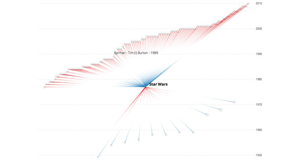
Stunning, playful, shrewd and at times brilliant, many of the presentations showed how the state of the art is being advanced. Kim Albrecht, a German designer, presented his work “culturegraphy” (here), depicting how popular films have referenced one another over time. The datashows 3,000 of the most “connected” films and their 10,000 interconnections (when one film makes a reference to another film), according to their descriptions at IMDB, a filmwebsite and database. The image above—static, alas—shows the movies that Star Wars itself references, such as 2001: A Space Odyssey, and ones that offer an artistic echo of the film, such as Batman.
It is a novel way to appreciate a vast amount of information that tells both a macro and micro story, by allowing viewers to see the overall pattern and to drill down into the particular. Static charts could never do this; their central quality is to compress information not release it. At first blush, the chart looks confusing—perhaps a new literacy is needed to meaningfully interact with the data? And the theme might seem juvenile. Yet one can imagineapplying the technique to understand literature, the nature of scientific discovery or more practically, patent valuations or drug compounds.
In a similar vein, Eimar Boesjes of Moonshadow Mobile, a data analysis and design firm in Eugene, Oregon, overlaid census data for income, ethnicity and other variables atop a map of the United States to offer a new lens on social cohesion and electoral politics (here). One can drill down not just to the state and county level, but the neighborhood, street and house level too; for example a static image of lower Manhattan by income bracket is at the top of this page. It is an easy creative leap to consider adding other data like house prices from Zillow or public information such as gun ownership (an issue that sparked outrage when a newspaper in Westchester, New York did just that in 2012).
Surely the day will arrive soon when the cornucopia of data won’t be stored and stale but alive and kicking, continuously updated akin to traffic or weather reports. At that time, the idea of presenting data in a static format will seem as quaint as Florence Nightingale’s coxcomb pie charts in the 1850s (here).
The VisualizediO conference was only one venue where the divergence between living and dead data was apparent. Another was the Information is Beautiful awards for best infographics in London in early November (here). The interactives that tracked refugees, how Americans die and how much food the world produces and wastes proved a richer way to communicate information than if they had been in print.
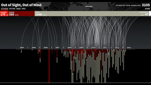
The same holds true for the book “The Best American Infographics 2014” published by Houghton Mifflin Harcourt in October. The most impressive works were interactive, notably one on drone strikes by Pitch Interactive in Oakland, California (above); Map Stack, an online mapping tool by Stamen in San Francisco; the racial composition of America by Dustin Cable of the University of Virginia and charts on economic mobility, employment and corporate taxes from the New York Times (all accessible here).
Static charts still have their purposes. They freeze time and concentrate the mind. Indeed, there are surely stories for which only a static chart will do. But in the past they were produced because there were no alternatives. Today the default is shifting whereby dynamic charts will become the standard format, and data-visualisation editors will have to deliberately choose to depict data in a static format. The stationary chart will be a preference not a limitation.


4 comments:
Excellent post, I agree with you 100%! I’m always scouring the Internet for new information and learning whatever I can, and in doing so I sometimes leave comments on blogs. I don’t do it for SEO purposes necessarily, but to learn new things.
must say that overall I am really impressed with this blog. It is easy to see that you are passionate about your writing. If only I had your writing ability I look forward to more updates and will be returning.
This is a nice and informative, containing all information and also has a great impact on the new technology. Thanks for sharing it
must say that overall I am really impressed with this blog. It is easy to see that you are passionate about your writing. If only I had your writing ability I look forward to more updates
Post a Comment